
I have followed through with my rock pool images, despite setbacks and technical issues, because I am determined to LEARN new tricks through doing. All too often I start on a project, have difficulties, shelve it, and therefore fail to learn from the experience. So... following on from my first rock pool image which started out as a reduction print, I thought I'd share some of the travails I have experienced as I endeavour to learn about woodcut printing.
When I google for information about using MDF/ customwood as a material for woodcuts it seems that people are fairly polarized in their views from "don't use it, it'll wreck your tools, it doesn't cut clean lines, it goes soft and furry..." to "it's cheap and easily obtained, it can be cut to any size or shape, it's easy to cut because it doesn't have a grain..."
My 2c worth:
- I use it because I have LOTS of off-cuts from making furniture so it IS cheap and to hand.
- It comes in large sheets 2400mm x 1200mm so it can be cut to any size or shape. It can also be bought in smaller sizes from hardware supplies or craft shops.
- It IS easy to cut because it has no grain.
- Unsealed, the texture of the MDF can show when printing blocks of colour. If you don't want this effect I dealt with this by undercoating the plate first with a standard undercoat-primer and sanding the surface.
Cautions:
- It is hard on your tools - it blunts them fairly quickly so you need to keep them honed.
- It doesn't like getting wet - it will swell, go fluffy, fall apart - so either seal it with shellac if you are going to need to wash the plate or, as I do, just put the plate through the press repeatedly with newsprint to remove the ink as much as possible.
- You don't want to be breathing in the dust so wear a dust mask as a precaution but if if you are cutting with chisels you are unlikely to be snorting up wood chips (I would hope).
- Don't over tighten the press because you can crush MDF but it is pretty robust.
 |
Reduction print: image marked up with a
Sharpie marker to make cutting easier. |
 |
"Anchor Me"
Reduction Print |
I was fairly pleased with the results of this first print but
I wondered what it would look like with a second tone of colour.
 |
| The image re-cut as 3 separate plates, still in a rectangle format. |
So, step 2: I decided to cut 2 more plates to accompany the black plate but there was still something that bothered me: it was very difficult to ink up a rectangular plate and NOT get ink where I didn't want it, especially in the hole in the middle. For this style of image I wanted it to be really clean edged. I don't have a hard, large roller that is wider than the plate so I am trying to ink up in all directions with a much smaller roller.
So... I cut around the images with a scroll saw and chiseled and sanded the edges to a bevel all around.
 |
The plates have been cut out with a scroll saw
and the edges sanded to a bevel all around. |
Of course, this was going to make registering a bit tricky! My solution: I drew cross-hairs on the back of the plates and matched this to lightly drawn cross-hairs on my printing paper. It took a fair amount (LOTS) of fiddling around to get it worked out initially and would have been much easier had I started out with this intention.
TIP: Don't draw pencil lines where you will be printing - it will show through the ink and you can't erase it once it is printed over!
 |
| Backs of the plates showing cross-hairs for registering. |
I liked the cleaner edges I achieved through doing this so big tick so far.
Next step: I wanted to create a more organic image and I wanted to see what it would be like with more colours. Of course, why not make it trickier! So, a new image was drawn up and 4 plates were cut.
I undercoated the MDF this time and sanded the surface to see if I might get a cleaner print. Interesting to note that any brush marks will print which can give a lovely effect, rather like wood grain.
Note to self - this is something to experiment with further next time.
To work out the 4 plates I designed, cut and printed the black plate first. I then scanned this into my computer, opened it in Photoshop and used "layers" to "play" with colour options and placement. Inspired I thought! Oh how I love technology!
 |
| The 4 blocks that make up the image "Deep Down" |
 |
First block printed.
Note the light pencil registration marks on the paper
which match up with the cross hair pencil marks
on the back of each block. |
 |
Inking up the 2nd block.
Note: I did 2 colour versions of this block,
one with a purple and one with a more muted soft grey. |
 |
Printing the 2nd block.
This shows how it was not an easy task to register the overlapping blocks with each other. |
 |
The 2nd block printed.
This is a purple version of the print. |
 |
| This is the 3rd block printed (over a grey version of block 2). |
 |
| The final block inked and ready to print. |
 |
| The final (4th) block registered and ready to print. |
 |
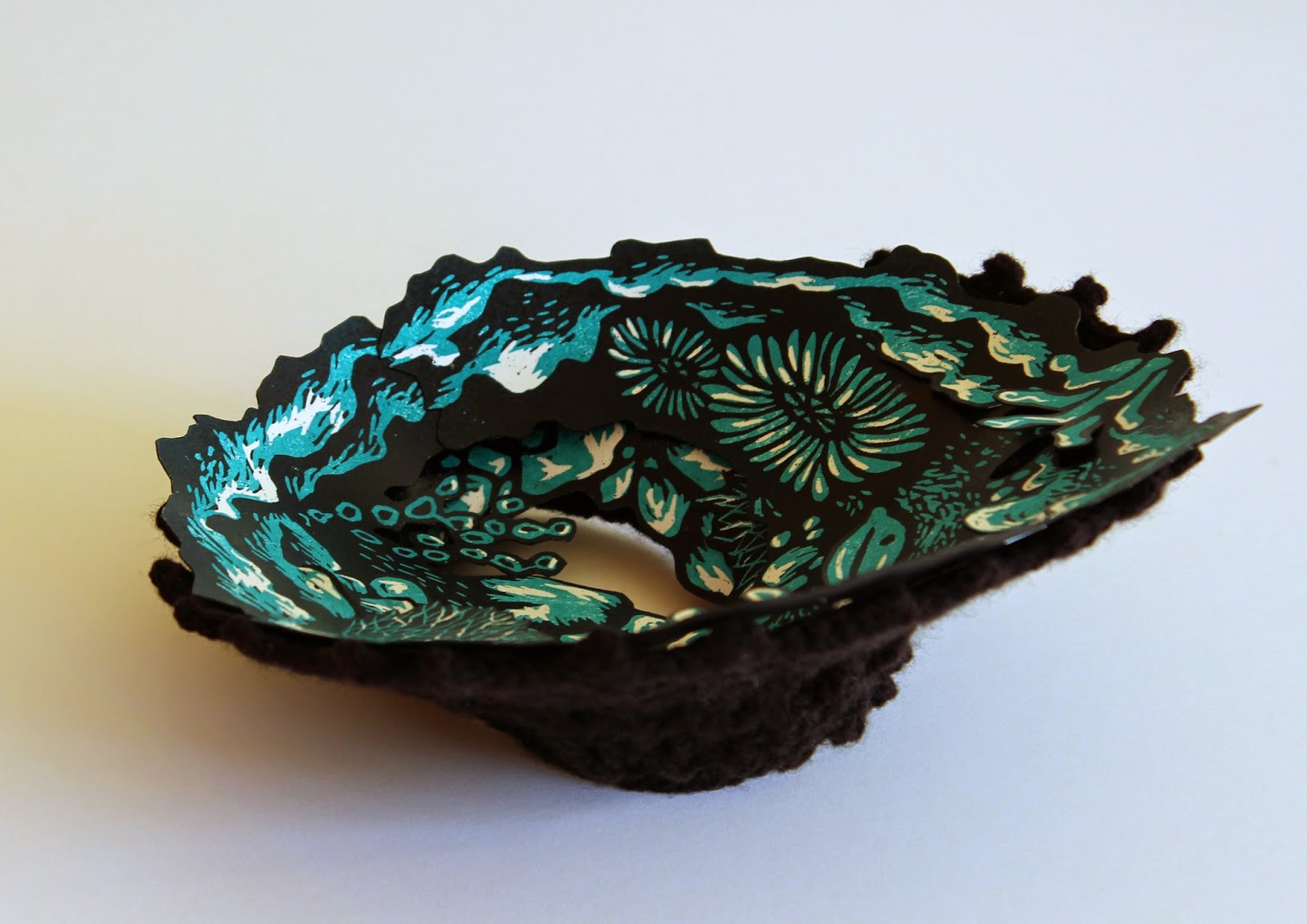
| "Deep Down" ~ The completed image (purple version). |
Although there were lots of little niggles along the way I've been learning lots of things through trial and error.
My biggest gripe, ongoing, is the quality of the printing inks. I've tried Fas water-based inks: they give clean, bright and glossy colours BUT they remain water soluble. Next I used water-based Flint inks BUT the red and blue are grainy and leave tiny speckles in light colours which is not desirable when you are wanting a nice clean image. Researching relief inks perhaps I should use oil-based inks BUT aaaargh, I can't stand the cleanup. I know Charbonnel Aquawash may be an alternative but they are expensive and I'd love to hear first-hand if anyone has used them for relief prints.
So, if anyone out there can recommend inks that they use for relief prints of this sort I'd love to hear from you.
Hope you find something useful in my experiments. Happy printing!


