The Barrel Store is an historic venue available for hire at the Corbans Estate Arts Centre in Auckland. It's a raw and rustic venue which brings with it a fair few challenges but it is also a large space which allows us to spread out and show a decent amount of work. It's a great chance for our print group, Waitakere Printer's Ink, to exhibit together and celebrate our enjoyment of printmaking as a group.
My focus this year has been to learn, develop and resolve skills and ideas through doing. And lots of. Two areas of concentrated effort have been exploring monoprinting and lino printing, neither of which I had much experience.
Any works not sold at the show are still available to purchase. Simply message me with your details and I can contact you directly to answer any questions regarding prices and availability.
 |
| Monoprint series by Toni Hartill |
MONOYPES & MONOPRINTS
These images were all achieved through inking up sheets of acetate to create layers of texture, hand cut paper stencils for the imagery and using ghost prints to achieve fine, delicate line work. They were all created from building up multiple layers and working intuitively, responding to what happens with each new development.
 |
"Submerged" series I - IX
Monoprints
by Toni Hartill |
 |
Kelp series I - IV
Monoprints
by Toni Hartill |
This is a more painterly approach to printmaking and quite different to the thorough planning undertaken in, for example, my dry point images or in my lino prints. As I am previously a painter who is learning to print, I enjoy the freedom this way of working allows and this in turn is influencing how I am thinking about my painting techniques.
 |
"Deep Blue Kelp" series I - VI
Monoprints
by Toni Hartill |
 |
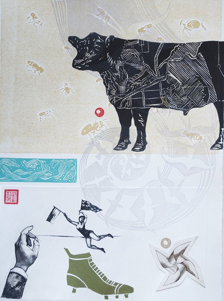
| Assorted prints by Toni Hartill |
To add to my monoprinting knowledge and to try to push my ideas and skills further I participated in a term of evening workshops at the
Browne School of Art taught by
Alexis Neal. This was just the boost I needed. It provided the motivation to continue to work on pieces between sessions, experimenting and trialing different ways of working. I ended the term with about 15 works that I was very pleased with and a whole new concept for a body of work (still work in progress).
 |
"Flotsam I"
Monoprint
by Toni Hartill |
 |
"Flotsam II"
Monoprint
by Toni Hartill |
 |
"Bedrock I"
Monoprint
by Toni Hartill |
This pair of prints is printed on 300gsm Hahnmuhler paper. Building up many, many layers using collagraph plates for textures, cut stencils, and transparent medium, the paper took on a leather-like quality which is quite delicious!
 |
"Bedrock II"
Monoprint
by Toni Hartill |
LINO PRINTS
As seen in
earlier posts this year I have been exploring possibilities with lino with a goal of working towards creating an edition of prints for a
portfolio to be sent to Portland. In the process of developing my lino printing skills I have produced a series of images along the way as I tweak and hone my final image for the portfolio. These are my largest linoprints so far with the lino block being A4 in size, printed onto A3 paper. I was really trying to capture the sense of movement and tension as the ecklonia is pushed and pulled by the surging sea.
 |
"Ecklonia"
Linoprint
by Toni Hartill |
 |
"Ecklonia"
Linoprint
by Toni Hartill
|
It was interesting to see how the image could be viewed from a variety of orientations. In the "Nocturnal Ecklonia" image I tried to capture a sense of the colours as seen underwater with the end result being very lustrous.
 |
"Nocturnal Ecklonia"
Linoprint
by Toni Hartill |
 |
"Nocturnal Ecklonia"
Linoprint
by Toni Hartill |
 |
"Reef"
Monotype, linoprint
by Toni Hartill |
 |
"Reef"
Monotype, linoprint
by Toni Hartill |
 |
"Cove" "Sway","Refugia", "Holdfast"
Linoprints
by Toni Hartill |
MIXED MEDIA
These works just seemed to grow of their own accord. I was interested in the matrix of the print and how it could be altered, extended, overlaid and added to, a concept I'm keen to explore further,
 |
Paper Sea I
Monoprint, collage, stitching
by Toni Hartill |
 |
Paper Sea II
Monoprint, relief, collage, stitching
by Toni Hartill |
 |
Assorted prints by Toni Hartill
|
Included in the show was a display of some of my collagraph plates with the intention of hopefully further engaging visitors in some of the print processes used and to give an idea of how much effort is involved in producing some of the works. I am tempted to create these as artworks in their own right.
 |
| Display of collagraph plates by Toni Hartill. |
Thanks for visiting. Any feedback is welcome.