I have a fascination with collagraphs:
I love that found and inexpensive materials can be recycled and used to make something beautiful.
I love that textures can be captured and reproduced.
I also love the almost sculptural process of creating the plates.
I am also continually challenged by collagraphs.
Just when I think I've "sussed" the process... technical issues arise. This can be very frustrating (to say the least) but it can also be the opportunity to push new ideas and try different approaches.
"Inky Goodness" group show
This series of images were created for a group show, "Inky Goodness", with my print group Waitakere Printers Ink. I chose to create a series of small images to "test-drive" some techniques.


Materials I used include cardboard (matte board scraps, cereal boxes), hessian and permafill (a plaster-like builder's filler).
 |
| "Wanderlust" $35 Collagraph with silver leaf by Toni Hartill Paper size 20cm x 20cm Edition of 3 |
 |
| "Castaway" $35 Collagraph by Toni Hartill Paper size 20cm x 20cmEdition of 4 |
 |
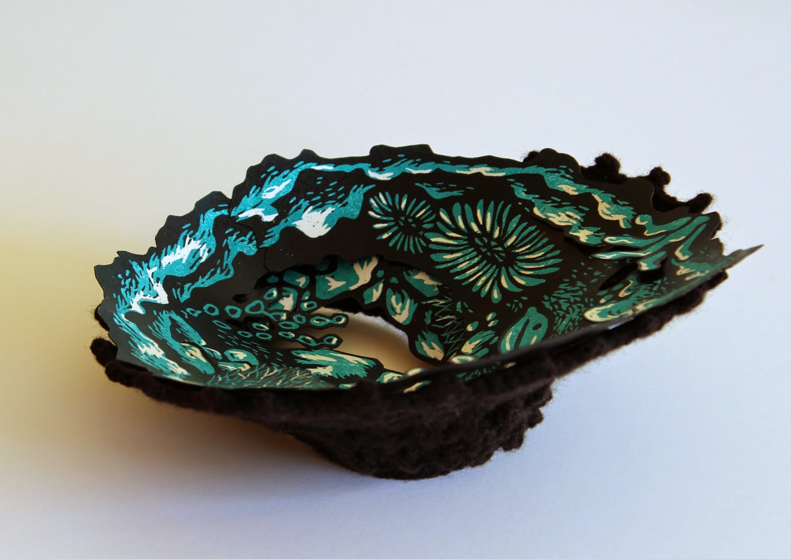
| "Ambrosia" $35 Collagraph by Toni Hartill Paper size 20cm x 20cm Varied edition of 6 |
 |
| "Ambrosia" $35 Collagraph by Toni Hartill Paper size 20cm x 20cm Varied edition of 6 |
 |
| Inky Goodness Quilt by members of Waitakere Printers Ink including circular collagraphs by Toni Hartill. |
"Antipodes" group show
This collagraph was created for the CPCANZ (Central Print Council Aotearoa New Zealand) group show with the theme "Antipodes". I used the theme as my starting point for this image "Memories Fade but Ties Remain". I explored the idea of how we collect and accumulate artifacts from our past (be it from our ancestors from the other side of the world, or from our own journeys and adventures) and these bits and bobs sit gathering dust, too "precious" to discard. As time passes, their true meaning or origins fade and are forgotten and yet their ties, and our ties, to our past (and to our future) will remain forever. This was also inspired by the concept of the Rope of Mankind, "Te Here Tangata", a term used to describe genealogy by Maori.
 |
| The collagraph plate for "Memories Fade But Ties Remain" by Toni Hartill |
 |
| The back of the collagraph plate showing the use of cereal boxes. by Toni Hartill |
 |
| The completed collagraph plate by Toni Hartill |
 |
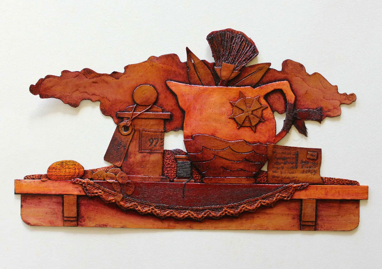
| "Memories Fade But Ties remain" Collagraph by Toni Hartill Edition of 4 This was a challenging plate to print as it is very complex, with lots of nooks and crannies and differing textures and thicknesses. I wanted the image to be washed out, as if it is fading as the title suggests. I also added a length of string to be blind embossed running off the page, to further illustrate the concept of the rope of mankind/ genealogy. |
Still life collagraphs
 |
| "The Beachcomber" $65ea Collagraph by Toni Hartill Edition of 4 |
This image was created along similar lines as the previous one using the idea of artifacts, this time collected from my wanderings along a beach (just as my windowsills attest to).
 |
| "Weighed Down by Sentiment" $110 Collagraph by Toni Hartill Edition of 3 |
This image was again influenced by the idea of the things that weigh us down and hold us back in our lives – things
we inherit, are gifted, acquire, accumulate… things we hang on to because we
feel we should.
Do we really need all
this “stuff”?!
These still life collagraph plates are, by nature, detailed and fiddly, mainly using cardboard scraps and the odd bit of string and fabric. (Considering I used to make miniature dollshouse furniture, my attraction to detail is not surprising... to me).
New works


Collagraph plate using pollyfilla, sandpaper, hammerite paint, & matte and gloss varnishes.
by Toni Hartill
For my next collagraph plates I wanted to experiment more with textures and the use of more painterly textures so I have spent time pouring over the works and processes of Brenda Hartill (no relation) - the queen of collagraphs, in my mind! Armed with a workbench of goodies including pollyfilla, sandpaper, hammerite paint, glues and varnishes, amongst other textural treasures, I am working on a new body of work in preparation for a group exhibition early next year. I am continuing to explore my theme of rockpools and oceans but this work is much more unpredictable and experimental as I "play" with techniques to see where it will take me.
Watch this space....
Some more collagraph artists who inspire me: