"The Coach vs the Critic"
Linocut
4 versions, various editions
Paper size: A4 / 210mm w x 297mm h
Paper: Fabriano Rosapina, 285gsm
SCROLL DOWN to see the MAKING OF
and the various colour VERSIONS.
The creation of this print has been a bit of a stray from my usual style and/or theme. Understandably, perhaps, as a result of the sneaky peeks I've been sharing on Instagram, a few people have been interested to know:
But, what's it for?
&
Why are you mixing up your usual style?
Well, quite simply, lockdown** has been hard!
I've had quite a battle, losing my creativity for months, then struggling to get anything new started. Not that this problem is unique to lockdown, nor to just me, but it was certainly "doing my head in", as it often does.
One of the hardest stages of creating new work, I find, is THE STARTING.
I have no problem with generating ideas, in fact I often feel overwhelmed by floods of ideas.
The problem I have is that in the cold light of the next day, my inner critic storms on in, uninvited, and takes over the conversation:
"Well, that's a stupid idea!
That's not going to work!
Why would you bother?!
You'll probably cock it up anyway!"
Etc, etc, etc...
It can often be very noisy in the room
and I'm the only one in there!
For some reason, probably because of the isolation of lockdown, the opportunity for my Critic to get so loud was a perfect storm. I know I wasn't alone feeling like this when I connected with other creative friends. The idea of confronting my "nemesis" sprouted and I began working on a variety of different approaches to both wrestle back control from my Critic and as a means of taking a light-hearted, low-pressure approach to starting some new work. It was also an opportunity to challenge myself to upskill my carving techniques. For one, I had never carved faces or HANDS before.
I also wanted to experiment with a more illustrative style with a view to possibly doing more illustration work. I always have ideas bubbling away that I'd love to illustrate yet it hasn't been my go-to approach and certainly not with my printmaking.
I also think it's very easy to get stuck in a rut creating work that we think others expect us to make. And, although I have done some illustration work before, including drawing people, this was not part of my current, recent work.
Every now and then I like to mix things up a little and do something unexpected, just to see where it takes me. And particularly when there's no pressure for it to be FOR anything - just because I want to give it a go, have a play. Besides, I'd hate to be predictable!
There were MANY prior variations and concepts for this work before this one stuck. My Critic often stuck her nose in and stopped me in my tracks so it was quite a process of self-doubt and self-talk to work my way through to an image I was happy, and "brave enough", to carve.
Finally, settling on this concept, the idea being that the image is like a playing card where the image can go either way up - topsy-turvy! My, perhaps slightly dubious idea, (only in that I've never seen it done before BUT don't see why NOT) is that the image could be framed and then hung either way up depending on how you are feeling! I imagine that a 2nd pair of D-rings would allow for this to be an easy switcheroo. Filling the image with symbolism was an excuse to include many quirky details and embellishments while also adding meaning for myself, and which might also resonate with others too.
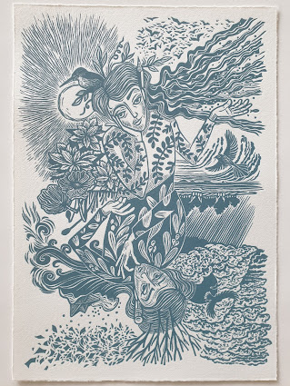
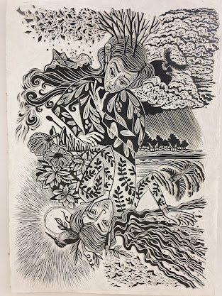
The Inner Critic
 |
| "The Coach vs the Critic" linocut by Toni Hartill |
The Critic is armed, with an eraser at the ready, to delete any ideas before they can develop. Lopped and dying trees shed any new growth, and ideas blow away in the wind. Birds of prey take flight, storm clouds weigh heavy and sheets of rain fall on a dark forest, while barbed wire barricades the boundary. New creations (a paper boat) are tossed in a turbulent sea. The Critic's outfit is adorned with a highly toxic plant and the tall poppies, that dared to grow, have been snapped and chopped to stumpy stems.
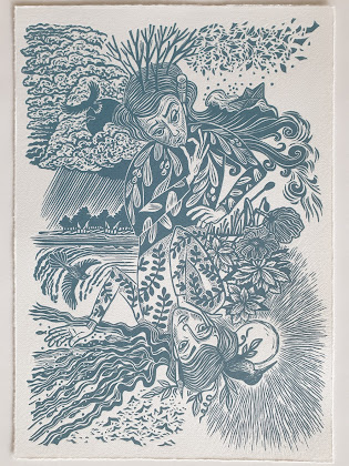
The Inner Coach
 |
| "The Coach vs the Critic" linocut by Toni Hartill |
The Coach, by contrast, is MUCH more chilled! She has a sharpened pencil at the ready and ideas take flight while the sun radiates warmth and nurtures new life. The kōtare / sacred kingfisher knows what to do and when to act, embracing the new and encourages you to follow your heart. A school of fish swims upwards and onwards reminding you to look ahead, not backwards. Now, the poppies bloom and the native shrub, mahoe, is said to help ignite passions and guide us towards our destinies. A restless fantail flits in the updraft, always moving and curious, above a calm sea and a distant horizon. The Coach's outfit is embellished with the leaves of the kowhai, said to symbolize personal growth.
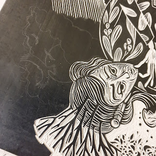
The Making of
After many hours of sketching and researching I eventually arrived at this topsy-turvy design, inspired by a playing card, among other things. The design was transferred to the prepared lino then the fun of carving began. Although a lot of the detail was pre-planned, there are a lot of mark-making decisions made on-the-trot so it's exciting to see what will emerge as I carve away the black lino surface. I also strive to embrace the incidental carved marks as they evolve and be prepared to change tack if something unexpected shows promise.
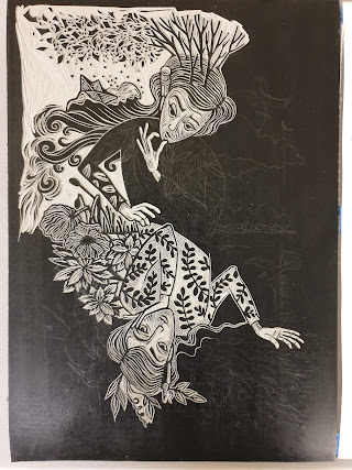
 |
| "The Coach vs the Critic" - the completed carved lino by Toni Hartill |
 |
| "The Coach vs the Critic" - the completed carved lino by Toni Hartill |
Printing
Always the most exciting part of creating a handmade print is test printing the lino block for the first time. At this stage you get to see how well the details print and whether you've managed to get the balance of dark and light quite right. You'll also get a good idea of how much cleaning up and editing needs to be done. Sometimes this can be a lengthy process of tweaking and refining but there wasn't too much that needed doing with this block. I'd obviously already been pretty pernickety as I carved each section.
I chose to print on Fabriano Rosapina, 285gsm as I love it's eggshell off-white colour and how it embosses so nicely when printing with lino.
Colours
As I often do, I had a preconceived idea of which colour I would print this image
so I began by mixing a stormy grey-blue.
To give a truer indication of each colour, as the photographs don't show the colours exactly as they appear, I have matched the dried ink colours to the nearest
Resene Colourshop paint colours using actual paint charts, not online colours. Please note that the way that the colours appear on your computer monitor will ALSO vary depending on how your monitor is calibrated. This grey-blue colour most closely matches to the oddly named paint colour "Tax Break"!
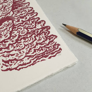
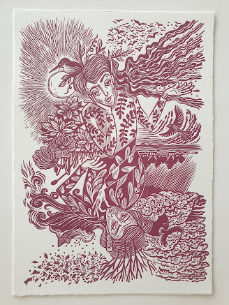
I then decided that I wanted to experiment with a range of colours to see if different versions might each radiate a different mood so next I mixed a colour which I would describe as raspberry.
For some reason, whenever I print with red I love the effect but I rarely set out with the intention of being so bold! (The actual colour of this ink is most closely matched to Resene's "Paprika".)
For my next version I fancied going a bit deeper and richer in colour so mixed a rich plum colour.
This colour most closely matches Resene's "Mulberry".
Finally, having a fossick around in my paper drawers I came across a lovely deep cream-coloured printmaking paper, very similar in weight to the Rosapina paper I was using. Printing onto a coloured paper added to the richness of the effect, again something I've not really explored before.
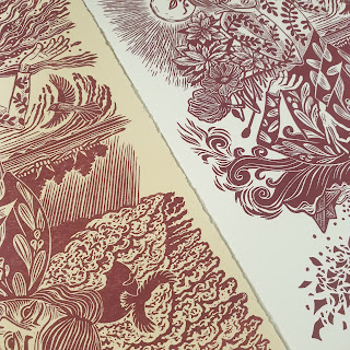
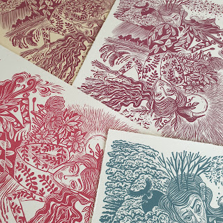
The Versions
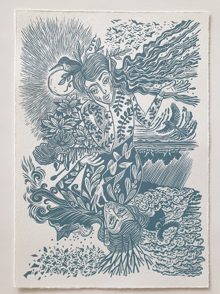 |
| "The Coach vs the Critic" Stormy blue / Version 1, Edition of 3. |
 |
| "The Coach vs the Critic" Raspberry / Version 2, Edition of 4. |
|
 |
| "The Coach vs the Critic" Plum / Version 3, Edition of 5. |
|
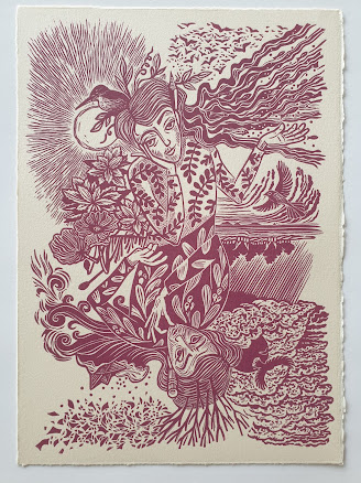 |
| "The Coach vs the Critic" Plum & Cream / Version 4, Edition of 3. |
|
Signing
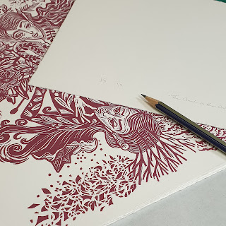
Unusually, because I have printed a number of colour variations of this image, and may yet print some others, I have decided to sign each colour as a separate edition and number them as versions, all with the same title. Because the image fills the paper, each print is only initialled on the front and signed fully on the back.
Very limited editions of each colour available.
FREE SHIPPING within NZ.
Pick-up in Auckland by arrangement.
It's been a lot of fun creating this image and I've certainly learnt some new tricks
and explored some new territory. I look forward to taking some ideas further in future works... but perhaps only when you least expect it!
And, as for my Inner Critic,
we're on better terms,
at present...
Thanks for visiting!
Please note: I DO welcome your comments and feedback!
Today I discovered that I had been receiving comments from people for a couple of years (!!) but I was no longer getting the notifications so they were LOST in the ether! Hopefully, I have rectified that little glitch and I will respond to you in a timely manner. My sincere apologies to all those who never heard back from me. I thought it very odd that all had gone quiet.
...........................
**Lockdown: Tāmaki Makaurau / Auckland, Aotearoa / New Zealand went into lockdown on August 17th, 2021 when the Delta variant of covid-19 arrived. Starting in Level 4, we remained in a strict level 3 lockdown for approximately 107 days when we finally began to open more fully due to high rates of vaccination. As I write this on the 14 Dec, 2021, the Auckland border remains closed and is due to open on Wed 15th Dec. It's been a long haul!