Sunday, 19 October 2014

Waitakere Printers Ink group shows, 2014


It's been a busy year for our wee print group "Waitakere Printers Ink".

We've had two shows at the Bruce Mason Centre in Takapuna, one in May and one in September.


 Our annual show at the Barrel store at Corban Estate Arts Centre was held 3-5th October.


A number of us have work in the current show A Peek at Print at the Victoria Park Market for Auckland's Art week. This was organized and curated by Ruby Oakley.


 and we are about to hang our latest show at the West Coast Gallery at Piha.
Opens on Saturday October 25th at 2pm. 


Thursday, 21 August 2014

The Common Denominator - Group Exhibition


This is the series of paintings I exhibited in The Common Denominator exhibition
at North Art, August 2014.

I look for beauty in unexpected, and often overlooked, places. 
These works are studies of the little “treasure chests” that are rock pools. 
It’s like I’m letting people in on a secret.  


Pink Barnacle Pool (SOLD)
Acrylic on Panel
220mm x 220mm


Detail of Pink Barnacle Pool


Ochre Pool, Takapuna Beach $250
Acrylic on Panel
220mm x 220mm


Detail of Ochre Pool.


Pebble Pool, Mahurangi $250
Acrylic on Panel
220mm x 220mm


Neptune's Necklace, Mahurangi $250
Acrylic on Panel
220mm x 220mm


Pohutukawa leaf in Pool, Pt Chevalier Beach. (SOLD)
Acrylic on Panel
220mm x 220mm


Detritus in Pool, Pt Chevalier Beach. (SOLD)
Acrylic on Panel
220mm x 220mm


Detail of Detritus in Pool.

Friday, 1 August 2014

The Common Denominator Group Show


I was invited to be a part of this group show by a good friend of mine, Fiona Graham. 

She wanted to put together a group show and so she selected friends, who are all practicing artists, to take part - Fiona is therefore "the common denominator."

Prior to the exhibition we only met once as a group and it was so lovely to meet these diverse and interesting women. We all paint, a few of us are also printmakers and I'm sure there are many other hidden talents and skills yet to be revealed. At this point only Fiona has seen a taste of everyone's work so it will be very exciting to see how the show will come together.

I am exhibiting a series of small paintings based on the theme of rockpools. This exhibition signals a return to painting for me after a couple of years focusing on printmaking. As I seem to have many opportunities to exhibit my printmaking I decided it would be a good opportunity, and a challenge for me, to create a series of paintings for this show. 

I am in a very different "place" from when I was painting previously so it has been interesting to see what would emerge this time round. I decided to work small so I wouldn't be intimidated and become bogged down. Each painting was completed over 2 - 3 days and once I had a sense for what was inspiring me about an image, they flowed very comfortably and it was a very enjoyable experience. It felt good to paint again!

The show opened on Sunday 4th August and runs until the 20th.

The show is listed on Arts Diary where you can view some images from the opening.

I was totally surprised and delighted to sell 3 paintings at the opening. And it was a pleasure to meet the new owner of my works. He will be taking them to hang in his beach house at Mathesons Bay, Leigh, north of Auckland. Perfect! This is where I met my hubby, some time last century, when we were working at the marine lab.

Monday, 28 July 2014

Matariki Exhibition : 2nd - 27th July, 2014


My wood cut series of rock pool prints, including my 3D print "Sea Nest" , were
included in this exhibition of various artists at the Lake House Arts Centre in Takapuna, Auckland.


Monday, 30 June 2014

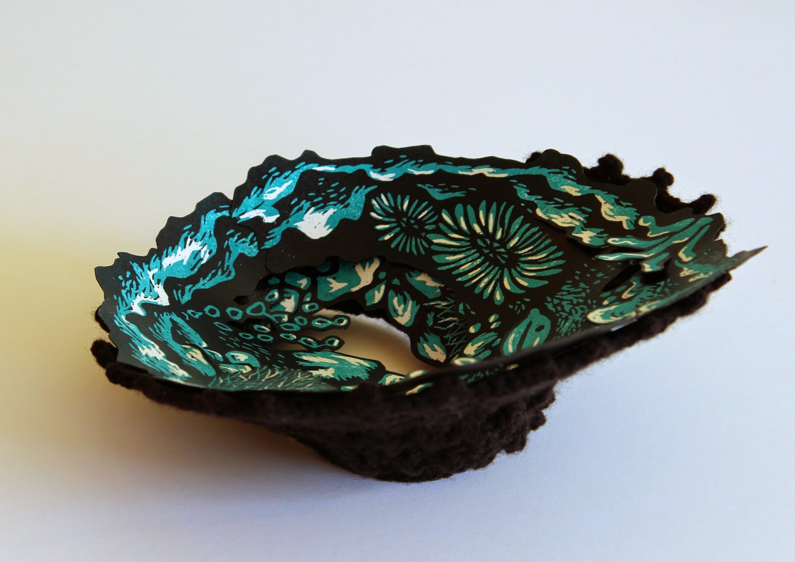
Woodcut "Sea Nest" - 3D print


"Sea Nest" by Toni Hartill (sold)


"Sea Nest" by Toni Hartill


This artwork was a natural progression from my 2D woodcut images. I imagine rock pools as little treasure chests or waka huia of the sea. 
I also think of them as “sea nests”, nurturing and protecting the life forms inside. The nest can be either wall hung or can sit on a flat surface.


Thursday, 19 June 2014

Woodcuts in the making - what am I learning?


I have followed through with my rock pool images, despite setbacks and technical issues, because I am determined to LEARN new tricks through doing. All too often I start on a project, have difficulties, shelve it, and therefore fail to learn from the experience. So... following on from my first rock pool image which started out as a reduction print, I thought I'd share some of the travails I have experienced as I endeavour to learn about woodcut printing.

When I google for information about using MDF/ customwood as a material for woodcuts it seems that people are fairly polarized in their views from "don't use it, it'll wreck your tools, it doesn't cut clean lines, it goes soft and furry..." to "it's cheap and easily obtained, it can be cut to any size or shape, it's easy to cut because it doesn't have a grain..."

My 2c worth: 
  • I use it because I have LOTS of off-cuts from making furniture so it IS cheap and to hand. 
  • It comes in large sheets 2400mm x 1200mm so it can be cut to any size or shape. It can also be bought in smaller sizes from hardware supplies or craft shops.
  • It IS easy to cut because it has no grain.
  • Unsealed, the texture of the MDF can show when printing blocks of colour. If you don't want this effect I dealt with this by undercoating the plate first with a standard undercoat-primer and sanding the surface.
Cautions:
  • It is hard on your tools - it blunts them fairly quickly so you need to keep them honed.
  • It doesn't like getting wet - it will swell, go fluffy, fall apart - so either seal it with shellac if you are going to need to wash the plate or, as I do, just put the plate through the press repeatedly with newsprint to remove the ink as much as possible.
  • You don't want to be breathing in the dust so wear a dust mask as a precaution but if if you are cutting with chisels you are unlikely to be snorting up wood chips (I would hope).
  • Don't over tighten the press because you can crush MDF but it is pretty robust.

Reduction print: image marked up with a
Sharpie marker to make cutting easier.


"Anchor Me"
Reduction Print

I was fairly pleased with the results of this first print but
I wondered what it would look like with a second tone of colour.


The image re-cut as 3 separate plates, still in a rectangle format.


So, step 2: I decided to cut 2 more plates to accompany the black plate but there was still something that bothered me:  it was very difficult to ink up a rectangular plate and NOT get ink where I didn't want it, especially in the hole in the middle. For this style of image I wanted it to be really clean edged. I don't have a hard, large roller that is wider than the plate so I am trying to ink up in all directions with a much smaller roller.


So... I cut around the images with a scroll saw and chiseled and sanded the edges to a bevel all around.


The plates have been cut out with a scroll saw
and the edges sanded to a bevel all around.

Of course, this was going to make registering a bit tricky! My solution: I drew cross-hairs on the back of the plates and matched this to lightly drawn cross-hairs on my printing paper. It took a fair amount (LOTS) of fiddling around to get it worked out initially and would have been much easier had I started out with this intention. 
TIP: Don't draw pencil lines where you will be printing - it will show through the ink and you can't erase it once it is printed over!


Backs of the plates showing cross-hairs for registering.

I liked the cleaner edges I achieved through doing this so big tick so far. 

Next step: I wanted to create a more organic image and I wanted to see what it would be like with more colours. Of course, why not make it trickier! So, a new image was drawn up and 4 plates were cut. 

I undercoated the MDF this time and sanded the surface to see if I might get a cleaner print. Interesting to note that any brush marks will print which can give a lovely effect, rather like wood grain. 
Note to self - this is something to experiment with further next time.

To work out the 4 plates I designed, cut and printed the black plate first. I then scanned this into my computer, opened it in Photoshop and used "layers" to "play" with colour options and placement. Inspired I thought! Oh how I love technology!

The 4 blocks that make up the image "Deep Down"

First block printed.
Note the light pencil registration marks on the paper
which match up with the cross hair pencil marks
on the back of each block.

Inking up the 2nd block.
Note: I did 2 colour versions of this block,
one with a purple and one with a more muted soft grey.

Printing the 2nd block.
This shows how it was not an easy task to register the overlapping blocks with each other.

The 2nd block printed.
This is a purple version of the print.

This is the 3rd block printed (over a grey version of block 2).


The final block inked and ready to print.


The final (4th) block registered and ready to print.

"Deep Down" ~ The completed image (purple version).

Although there were lots of little niggles along the way I've been learning lots of things through trial and error.

 My biggest gripe, ongoing, is the quality of the printing inks. I've tried Fas water-based inks: they give clean, bright and glossy colours BUT they remain water soluble. Next I used water-based Flint inks BUT the red and blue are grainy and leave tiny speckles in light colours which is not desirable when you are wanting a nice clean image. Researching relief inks perhaps I should use oil-based inks BUT aaaargh, I can't stand the cleanup. I know Charbonnel Aquawash may be an alternative but they are expensive and I'd love to hear first-hand if anyone has used them for relief prints. 

So, if anyone out there can recommend inks that they use for relief prints of this sort I'd love to hear from you.

Hope you find something useful in my experiments. Happy printing!


Monday, 2 June 2014

Woodcuts on Show - in Hawera and Takapuna, NZ.


I have just hung work in an exhibition with my print group, Waitakere Printers Ink, at the Bruce Mason Centre in Takapuna. Determined to continue to develop my skills using woodblocks I created a series of prints based on my continuing theme of rock pools. 


The first image I created was a 2 colour reduction print called "Anchor Me." The title was inspired by the shape of the image which reminds me of the shape of a traditional Maori anchor stone. I was also exploring the idea of what it might be like to retreat into a rock pool to hide from the outside world, safe and secure - anchored - (ignoring any risks of hungry crabs of course!) There is also a bit of ambiguity here, are we, the viewer, looking INTO a pool or are we looking OUT? 

"Anchor Me"
Reduction Woodcut Print
by Toni Hartill


For the second image I wanted to explore the possibilities a little further so I designed and cut 2 more blocks to print two tones of teal green prior to the black layer. This image is richer in colour and yet less punchy as there are no white highlights. For the presentation I layered up 4 prints, cutting out the centre of the image and rotating each print until I was happy with the composition. I titled this print "Set Me Free" as a follow-on from "Anchor Me". This time I was imagining what it might be like to have the freedom to go off on an adventure in a rock pool (again ignoring the munchy things.)

"Set Me Free"
3 Block Woodcut prints, layered
by Toni Hartill


For my next image I wanted my rock pool to be less symmetrical, more free-form. I was inspired by actual rock pools at Takapuna Beach for this one and I was particularly taken with the fluted barnacles that grew in "blossoms" around the pools. Taking what I had learnt from the last print I decided to make things even more tricky for myself and go for 4 blocks. This of course increased the challenge of registering each layer (but since when do I take the easiest route?!) My initial vision was to create an image with quite vibrant colours (as the real rock pools are a deep pinky purple) but I also wanted to see it in more muted colours, more restful. I also experimented with adding texture to the water of the pool, giving the impression of being IN the pool, looking out, hence the title "Deep Down".

"Deep Down"
4 block woodcut print
by Toni Hartill
"Deep Down"
4 block woodcut print
by Toni Hartill


In April I sent one of my woodcut prints, "Deep Down", to the Lysatt-Watt Gallery in Hawera to be a part of the Central Print Council's "Devil in the Detail" exhibition. The theme of the exhibition required the print to either include the letter D in the image, or for the title of the work to begin with D.  Although I couldn't make it to Hawera in person to see the exhibition it looks like it was a wonderful show of members from around the country. Thanks CPCANZ.


My print "Deep Down" can be seen just to the left of the arch.

Sunday, 13 April 2014

Illustrations of water features


One of the many things I've been working on of late are a series of illustrations, for a landscaping company, Cempro, to promote their man-made water features on-line. My name was put forward for the job, with others', and I took the opportunity to "run" with it as I am looking to do more illustration work and to stretch my creative wings with new projects. Although I had never done any work of the sort before that combines the use of illustration with photographic images I figured that I had enough skills to set me on my way and I have since honed these skills through the process of doing. 

The task of illustrating gardens harps back to a previous life when I worked for a design company and I would do landscape impressions for people looking to enhance and develop their properties. Something I didn't take into account in quoting for the job was how long it would take to come up with a suitable planting scheme to suit each water feature and style of garden as I wanted the plants to mostly be real and identifiable, not just random indistinguishable greenery. As it turns out it has been a bonus for the client to have identifiable selections of plants - he is confident that it will help to sell his products as it will help people to know how to plant them up. 


Illustration roughs
Before I set my brushes to work, his photographer, Shelley Lewis, had to photograph each of the features with water running through them. She then prepared the files for me as a silhouetted image on a transparent background. I then used her images to work up a rough in pen and wash which I would submit for approval. 


Illustration final - watercolour
I would then go on to create the final image on heavy watercolour paper, starting with the watercolour and finishing with the line work using a pigmented liner.

Illustration final - pen work

The last step was to merge the two images on Photoshop.

Illustration-the merged image

This is still work in progress as I await the next batch of products to work on. It will be some time yet before the images are on-line, presumably on a newly designed website. 
Watch this space. 

Although challenging on several levels, it has also been a thoroughly enjoyable experience, especially getting me working in watercolours again, which I haven't used for a very long time. And, having the excuse to pour over gardening books and to peer into people's gardens to look for inspiration. I also find that I am looking at plants in a totally new light again - as in how I would draw them and render them in watercolour.


Sunday, 16 March 2014

My Printmaking Press set-up

It's been a little over 6 months since we (mostly hubby) transformed a rusty old 1908 Ewbank "Little Giant" mangle into a printmaking press, and it has been busy ever since! It's come to my attention that others are interested in what I'm up to in my basement workshop and so I thought I'd share some info about how I have set up my press with minimal outlay, using found and re-purposed bits and bobs.


Detail: "Rockpool ~ Softly Sleeping", Drypoint
Initially, when we finished restoring the mangle, I was working on dry points using plexi-plate, oil-based inks and soaking my paper. The press can be cranked up really tight and I'm really happy with the results.


Woodblock print in progress
Now that I'm working on woodblocks the press needs to be set much lighter. With a small alteration to the spring arrangement on the mangle (ie. a piece of metal pipe inserted to prevent the spring "slopping" from side to side) it has been doing a grand job. I simply count the number  of rotations, or half/quarter rotations of the screw fittings and I have got to know how many turns are needed for which plate and for which blankets, etc.


My "Little Giant" featuring metal rollers, runners and my high tech laminated hardboard bed.  

The bed: As I mentioned in my earlier post on the press I made the executive decision to forgo the use of a laminated plastic bed, or a metal bed, due the cost. Instead I decided to make do with two sheets of hardboard which we laminated together. It's still works just fine and show no signs of wear so... if it ain't broke.... On a side note, while I was on holiday down south I went to an amazing print gallery in Old Cromwell Town called OCTA. The owner has a press set up in the back of the gallery and I noticed his bed is simply a sheet of thick plywood. If it's good enough for him....


Felt underlay from an old upholstered armchair
The blankets... well, we all know how expensive they can be. So again I use what I had to hand: some old felt underlay from an old upholstered chair. It looked too good to throw away and surely I'd find a use for it. Sure enough. I use it as the first layer on top of the tissue placed over my work on the bed.


Main blanket: a foam camping mat!
And for the main blanket I use one of those foam camping mats that cost about $9. We already had one, scavenged from the side of the road no doubt. They have so many uses (except for sleeping on!) and everyone should have one in their supplies. (They make a great spatula for applying grout to mosaics and tiling.) Over time, they slowly compress if you are doing lots of prints but they bounce back and if and when it gets too squished, I'll find another.

Inking up: I use a glass plate - an old safety glass window pane. Personally I like to roll up on glass and I simply put a sheet of white paper underneath so I can see the colours clearly for mixing.

To sum up: The mangle cost $125 from a junk shop, the metal tube for the rollers and the runners cost $30. It was going to cost $500 for an engineer to put the metal tube onto the wooden rollers and lathe them but coincidentally our neighbour is a toolmaker and he did them for us out of kindness and generosity! (Bless his little cotton socks!) Metal fittings - nuts and bolts and screw thread rods, and paint cost about $50. The hardboard bed - scraps from an old bed base. Blankets: repurposed from found items. Hours of printmaking: PRICELESS.


It's wonderful having a press here at home so I can work as the mood takes me. I'm currently working on a series of woodblocks in readiness for group shows coming up in the next few months. In between other commitments I can "pop" down to the workshop and "whip" off another colour run and not worry about having to pack everything away in between sessions. I set up a paper cutting and registering table on the bench saw, I have my inking up station on my studio bench and I have a wash up area just out in the carport with a large stainless tub and wooden bench. And I ban hubby from any woodwork projects til my print run is done - dust!