Showing posts with label linoleum. Show all posts

Thursday, 2 July 2020

Lino printing t-shirts - my thoughts on Speedball Fabric Ink


Lino printed t shirts byToni Hartill

As I've had a few inquiries from other printmakers I'd thought I'd share
my experience of lino printing t-shirts, and the inks I've used.

Last year I was lucky enough to get my hands on a box set of Speedball Block Printing ink, designed for fabric and paper. I've long wanted to trial print some t-shirts using my linocuts. I have used water-based Flint ink in the past but, even with heat-setting the ink with a hot iron, the ink is not designed for this purpose so I don't feel confident with its longevity.


This set of inks comes with 6 x 37ml tubes of black, white, red, yellow, blue and green.

According to the instructions the inks don't need to be heat set.
Instead just leave the inks to "cure" fully for 4 - 7 days, then they can be washed. 

As an extra precaution I have ironed prints with a warm iron for several minutes. 
My initial printed tees have weathered well and been washed cautiously a couple of times. 
They seem to be lasting well, so far. 

Meanwhile, a t-shirt I printed for my husband was, unknowingly, put through a normal wash with a full load of washing and I did notice that it faded in that first wash. It hasn't faded any further in subsequent washes.


Below is a step-by-step description of how I printed my t-shirts.

Preparations


Slip a thick piece of paper inside the t-shirt where the image will be printed to stop ink bleeding through the fabric. Mark where the lino block will be positioned on the t-shirt using tape.

The first two photos are the set-up used to print my snail bubble print.


 Below shows the press set-up for printing my large "Snaily" lino block.


"Snaily" t shirt by Toni Hartill


 The Speedball inks have a bit of a smell although not over-powering. I would still recommend using them in a well ventilated area. They wash out with soap and water so clean-up is EASY!


Black Speedball Ink - My thoughts


The black ink has a very slightly thicker "gritty" or matte texture and so it rolls out nice and evenly, creating an even and dense layer and rolls onto the lino solidly.

Lino cut inking up by Toni Hartill


 If I was printing multiple t-shirts I would cut a heavy paper mask to protect the surrounding areas where I don't want to get any ink. Even when taking a lot of care it is very easy for the roller to accidentally get ink on the background. I think its easier not to get ink where you don't want it than to try to remove ink once its there!

In this case, as I was only printing a single t-shirt I just masked the areas with tape. The tape is removed after inking and before printing. In this case the tape was able to be removed as a complete shape and reused for the next print.

Its important to make sure you ink up the plate evenly with thin coats getting to all of the edges and details. Holding the block up to the light helps to check the surface is fully coated but it can still be difficult to be sure. For this reason I think it is important to work in a methodical manner inking up each area of the block.


Inking up with black Speedball ink,  Toni Hartill

Inking up with black Speedball ink,  Toni Hartill


 Printing

 Set the press up as you would normally to print lino. I use wooden runners and thin mdf "pushers" instead of blankets. The pressure is set firmly down onto the runners but not overly tight. You do need to take in to account the thickness of the t shirt.


The press set-up Toni Hartill


The reveal


Note: Unusually, this lino block has a border of lino left surrounding the image and this has left a pale rectangular mark on the t-shirt from the pressure. This will disappear once the t-shirt has been washed for the first time.  


"Stick to your Bubble" lino printed t shirt by Toni Hartill

My "Stick to your Bubble" linocut was created for a print exchange "Distant Conversations" inspired by the experience of being in "lockdown" during the Covid-19 pandemic. Visit my earlier post here to view the making of and more about the prints, including how to purchase.


"Snaily" Linocut T shirt by Toni Hartill


Coloured Speedball Inks - My Thoughts


The coloured inks seem to be slightly thinner, less opaque, less sticky and therefore to have a slightly translucent quality. When they roll out they feel more slippery and I found it was difficult to rollout an even area of thin ink. The instructions on the box say to use a hard rubber roller while the instructions in the online video say to use a soft rubber roller. I used a hard Esdee roller rather than my soft Speedball roller. The soft Speedball one may have been better but I was following the instructions on the box.


 In my first batch of t-shirts I trialed using the coloured inks and printed a teal version of my rockpool lino block using a mix of blue and green ink. Likewise I found the coloured ink to be harder to roll out and to coat the lino block evenly although the final print was mostly even. Not "perfect" but not too bad.


Rockpool lino printed t shirt by Toni Hartill


To mix the slightly purple colour of the ink for my bubble print I mixed blue and red ink. I tried adding a little black for depth of tone then added a wee bit of white to try to improve the opacity of the ink but it didn't make much difference.

It was therefore more difficult to evenly ink up the block particularly in the fiddly outer details despite multiple passes with thin coats.


Inking up with coloured Speedball ink,  Toni Hartill


"Stick to your bubble" lino printed t shirt by Toni Hartill


 Comparing the Black vs the Colours


The black ink most definitely produces a much crisper and more solid image than the coloured inks. I have, thus far only used the blue and green inks with a little bit of red and in my experience these colour pigments can tend to be more translucent anyway.

You can see, in the images below, how the ink has printed much more solidly with the black ink than with the blue ink.


Black Speedball ink, Toni Hartill

Coloured Speedball ink, Toni Hartill

Coloured Speedball ink, Toni Hartill

Black Speedball ink, Toni Hartill


You can visit the Speedball website to view their specifications, 
see their FAQs and view a video on how to use the inks.

My impression is that their demonstration of inking up the carved block uses ink in a much thicker application than I would dare (for fear of bleed and filling in fine details). They are, however, printing a simple design by hand in their demonstration and so therefore a thicker coat would be necessary.


In conclusion

All of the t shirts I have printed onto are cotton knit fabrics.

At this point in my experimentations I would recommend the black ink over the coloured inks for inking ease and print quality. I am really pleased with how sharp and clean the ink prints onto the t-shirt fabric.

The coloured inks are more translucent and harder to get a strong clean print with but perhaps this just takes a bit of trial and error to perfect a technique.

I am yet to really "test" the durability of the inks through multiple and "normal" washing but, with a bit of care when washing, they are so far lasting well.

 Of course there are so many variables when printing so I would suggest, if you have the opportunity to give these inks a go, go for it and see what you think.The handy sample pack is a great way to start.


Thanks for visiting!


Monday, 8 June 2020

"Distant Conversations" - Covid-19 inspired Print Exchange


Linocut edition. Toni Hartill


The Covid-19 pandemic reached New Zealand in late February 2020. As NZ went into a nation-wide "lock-down" on the 26th March, in order to stop the spread of the disease, printmaker crony Celia Walker sent out a call to a group of 16 printmakers across the country to participate in a print exchange inspired by our experiences during our period of isolation.

EDIT: To view the final exhibition "Distant Conversations" see my later post here.


My print was inspired by the concept that was drummed into us on a daily basis on all media
"Stay in your bubble" and features NZ kauri snails, a favourite critter of mine.


Kauri snail linocut. Toni Hartill


My appreciation for snails began when I read the utterly charming book "The Sound of a Wild Snail Eating" by Elizabeth Tova Bailey. I have not been able to squish a snail since!

And ever since I created a linocut kauri snail for the group exhibition "Forest has the Blues" I have become even more taken by snails. They have perhaps now been adopted as my totem animal.

"Snaily", aka "KS" traveled to Spain with me last year and has in fact become something of a celeb in his own right! Check out #snaily on Instagram and you'll find him there as you scroll down.


Snaily at Sergovia, Spain, 2019.


Snails also seemed to be a particularly apt symbol to use at this time representing adaptability, the need to slow down and make the most of what you have to hand.
The shell itself can symbolize safety, protection and self-reliance while the shell's spiral can represent growth, evolution, the cycles of nature, continuity, etc. Also the snail's habit of withdrawing into its shell when a threat is perceived, and its ability to seal itself away for long periods being completely self-reliant also seemed especially relevant.

At a time when we were confined to our homes and
our lives had to slow right down... well, you get the picture.


"Stick to your Bubble"


Paper size: 17.5 cm x 25 cm
Media: Linocut
Paper: Hahnemuhle Stella Matte, 230 gsm
Edition of 30


I have printed an edition of 30 prints,
allowing for 16 for the exchange and the remaining edition to be available for sale.


I am offering a limited number of prints 

for just $85 each.
 
Free shipping within our NZ bubble!
 

 EDIT: Currently available from my online shop: tonihartill.felt.co.nz


International shipping additional. 
Please inquire for price and policy
and to purchase. 

UPDATE: SOLD OUT!

Note: There are likely to still be delays 
in shipping internationally.


Toni Hartill

So, if you'd like a wee memento of our Covid-19NZ experience
please contact me directly if you are interested in purchasing a print.


Toni Hartill


Prints will be packed in a cellophane sleeve*, backed with card,
and wrapped with recycled cardboard to protect the print while in transit.


*Why a cellophane sleeve?
This protects the print from moisture and finger prints and means the print can be displayed and enjoyed until / instead of  having it framed.


Toni Hartill


The making of


Click on an image: it will enlarge on your screen and
you can then scroll through all of the images.

Or just continue scrolling here.


Toni Hartill
Toni Hartill
Toni Hartill
Toni Hartill
Toni Hartill
Toni Hartill
Toni Hartill
Toni Hartill
Toni Hartill


The progression of carving the lino

The quality of the pics in this video are not great - I snapped the pics at the end of each carving session as a record of WIP (work in progress) so the lighting is pretty dodgy I'm afraid. 


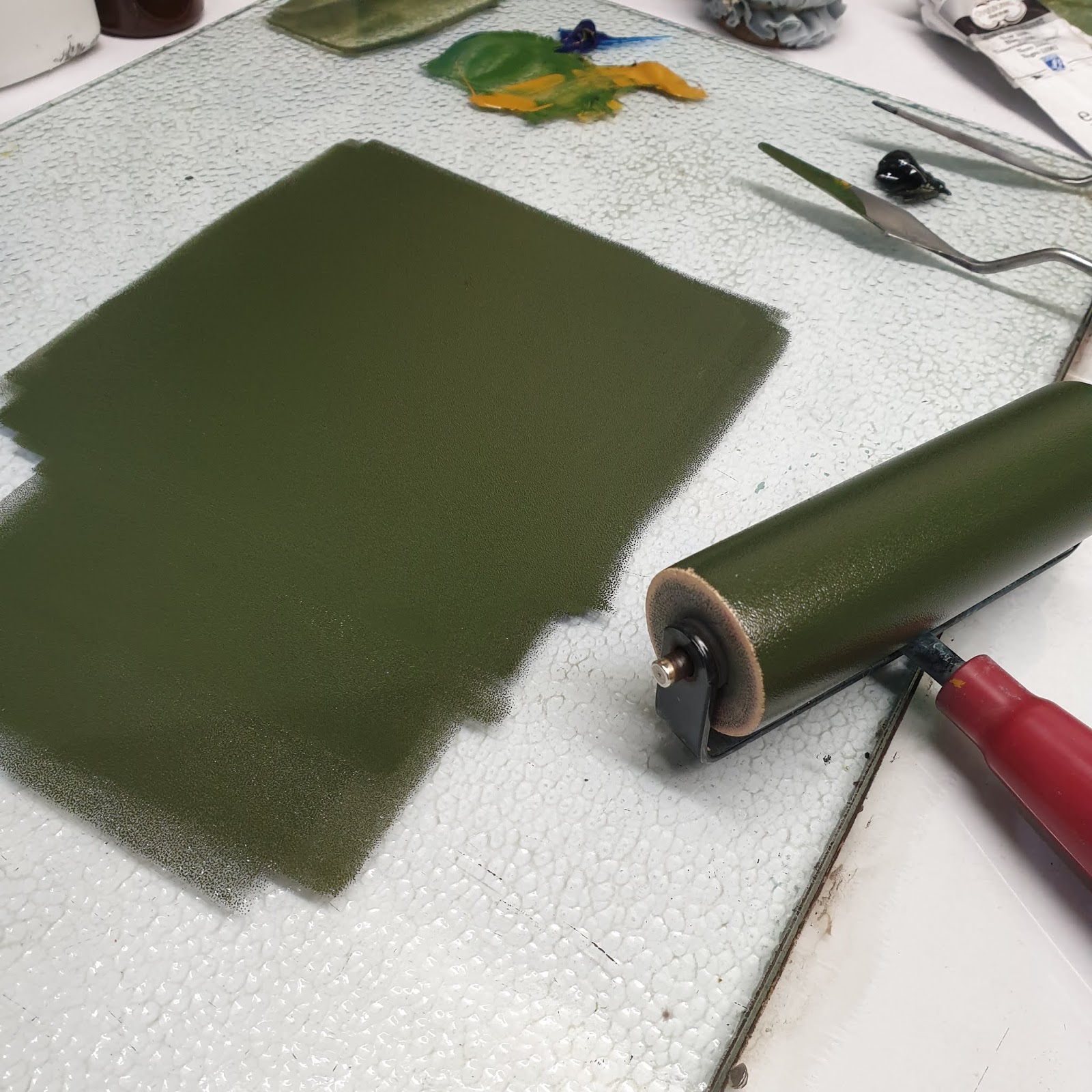
I chose to mix a dark, warm, mossy ink colour for this print,
so although it can appear black in the print, look closely, it's not quite.
(I actually seldom use a straight black ink.)


Toni Hartill
Toni Hartill
Toni Hartill
Toni Hartill
Toni Hartill

Toni Hartill


This was such fun to work on.
Its the first lino cutting I've done since last year as I've been fully immersed in learning to etch aluminium with copper sulphate. I've discovered a deep love for both techniques, which couldn't be more different, but I do so LOVE to carve lino, as this has reminded me. I have some new challenges set for myself to "up my game" so stay tuned.


I look forward to receiving the exchanged prints from the other artists in the group and I will share them in a new blog once they all arrive later in the year.


Many thanks to Celia Walker for organizing this welcomed diversion.


A delighted "Snaily" - sidekick of Toni Hartill


Snaily was certainly chuffed to feature!


Thanks for visiting!


Tuesday, 26 February 2019

"Forest has the Blues" - NZ Clematis Linocut


"NZ Clematis - Puawhananga" (detail)
Linocut by Toni Hartill


2019 has begun, for me, with a steady graft towards an array of upcoming deadlines.
One of the biggies for this year is an all-new-look presentation of the group show 
"Forest has the Blues"
- coming July, 2019 at the Steel Gallery, Franklin Arts Centre, Pukekohe.

Our team of artists are again collaborating towards this year's event which includes an even larger installation than last year's, in a completely different colour palette and style, plus a collection of exhibited works by each of the seven artists. This year we are also including 2 groups of students from 2 Auckland secondary schools: Pukekohe High School and Westlake Girls High School. 

To view previous posts about last year's "Forest has the Blues" exhibitions 
or click on the link in the right hand "Exhibitions" column.

I will write more about the kaupapa (purpose) of the project in coming blogs but for now I thought I'd share my progress thus far on a new large linocut I have created with the installation in mind.


 Last year I created a even larger linocut of the invasive weed the moth plant, complete with nasty ol' seed pods. I think, despite its invasive nastiness its a rather pretty plant with its grey green foliage and its unusual sculptural white flowers. However, we are not meant to admire it - we are meant to rip it from the earth and destroy any we see - pods, roots and all!

This year, for a complete contrast, I thought I'd move to the bright side and create one of my favourite native plants: the NZ Clematis. This plant likes to have its roots sheltered in the cool shade but reaches for the skies forming a lush display of starry white flowers above the canopy of the forest - a much more uplifting metaphor!


 As always, beginning a new project after a hiatus from using a particular technique, I feel the fear of failure looming over my shoulder. Carving an image  which will be read in just one colour does not come naturally to my brain and it takes quite a bit of psyching to be able to think in terms of positive/ negative, light/ dark, near/ far, etc. Anyway, best way forward, I find, is to begin with a detailed drawing, then simply dive on in and hope for the best! 


My greatest apprehension with trying to render a clematis flower was how to tackle the complicated centre structure. I began with some close up sketches to grasp the idea then experimented on some scrap lino til I was able to simplify the positive and negative areas in a way that still "read" correctly.


A super exciting moment is always proofing the lino for the first time. 
This is also a chance to stand back and view the image for a couple of days to contemplate if it all reads as I'd hoped or if any further carving is necessary. (I also worry that I could just as likely ruin it by making changes - this can be a bit of a stressful, dithering stage for me!)


" NZ Clematis - Puawhananga" (detail)
Linocut by Toni Hartill


 I was reasonably happy with the image at this point so I decided to "whip up" a small edition 
 in black (as it was looking quite striking, if I do say so myself... and before I risked ruining it!) 
By the way, I rarely use black in my work and actually this (like most of my work) was never intended to be printed in black.


Next step was to test it in pale blue as I had envisaged it for the installation.


Hoo-hoo, another of my favourite things to do
is to roll new ink onto a clean lino block!
Reminds me of those magic colouring books we had when I was a kid
- just add water and an image appeared - only this is much better, 100 fold!


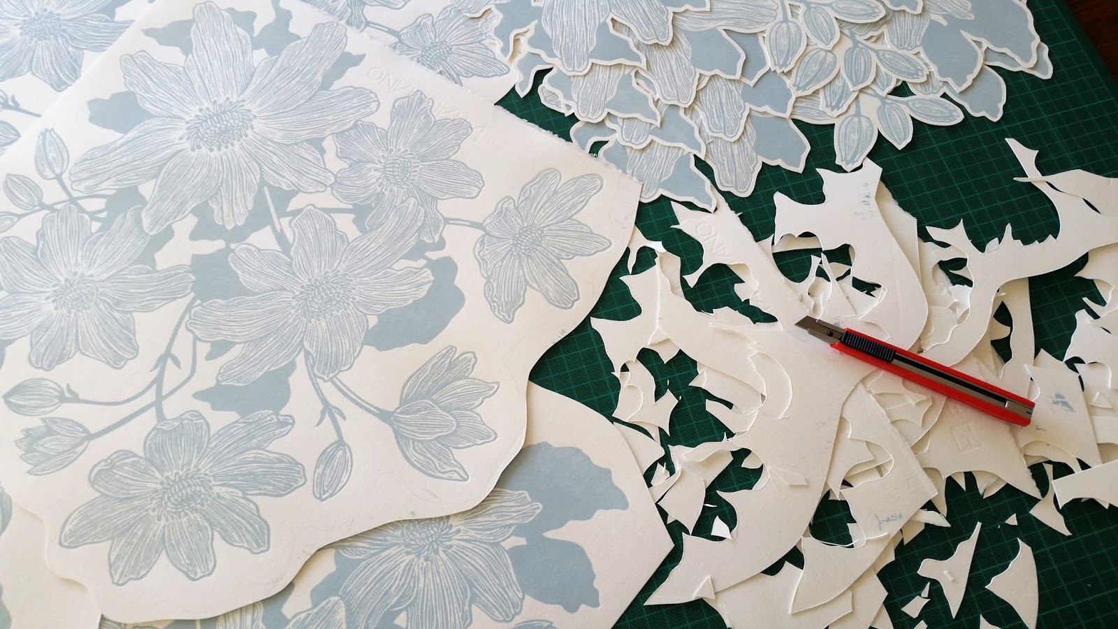
Next task was to print multiples of the image in pale blue...


and then to cut them all out.


Lastly I need to decide on how they can be installed en masse 
by experimenting on my studio pin-board.


 Plenty of time to to let ideas percolate 
so in the meantime they are quite happily
blooming on my wall.


Cleaned Clematis lino block - by Toni Hartill.


Updates on further progress
towards 
"Forest has the Blues" 
to come
 so watch this space.

Subscribe to receive email updates in your inbox 
or follow me on

Instagram @tonihartillart
or facebook: tonihartillart


Also follow 
#foresthastheblues
and
our FhtB facebook page: foresthastheblues


Thanks for visiting!