Thursday, 2 July 2020

Lino printing t-shirts - my thoughts on Speedball Fabric Ink


Lino printed t shirts byToni Hartill

As I've had a few inquiries from other printmakers I'd thought I'd share
my experience of lino printing t-shirts, and the inks I've used.

Last year I was lucky enough to get my hands on a box set of Speedball Block Printing ink, designed for fabric and paper. I've long wanted to trial print some t-shirts using my linocuts. I have used water-based Flint ink in the past but, even with heat-setting the ink with a hot iron, the ink is not designed for this purpose so I don't feel confident with its longevity.


This set of inks comes with 6 x 37ml tubes of black, white, red, yellow, blue and green.

According to the instructions the inks don't need to be heat set.
Instead just leave the inks to "cure" fully for 4 - 7 days, then they can be washed. 

As an extra precaution I have ironed prints with a warm iron for several minutes. 
My initial printed tees have weathered well and been washed cautiously a couple of times. 
They seem to be lasting well, so far. 

Meanwhile, a t-shirt I printed for my husband was, unknowingly, put through a normal wash with a full load of washing and I did notice that it faded in that first wash. It hasn't faded any further in subsequent washes.


Below is a step-by-step description of how I printed my t-shirts.

Preparations


Slip a thick piece of paper inside the t-shirt where the image will be printed to stop ink bleeding through the fabric. Mark where the lino block will be positioned on the t-shirt using tape.

The first two photos are the set-up used to print my snail bubble print.


 Below shows the press set-up for printing my large "Snaily" lino block.


"Snaily" t shirt by Toni Hartill


 The Speedball inks have a bit of a smell although not over-powering. I would still recommend using them in a well ventilated area. They wash out with soap and water so clean-up is EASY!


Black Speedball Ink - My thoughts


The black ink has a very slightly thicker "gritty" or matte texture and so it rolls out nice and evenly, creating an even and dense layer and rolls onto the lino solidly.

Lino cut inking up by Toni Hartill


 If I was printing multiple t-shirts I would cut a heavy paper mask to protect the surrounding areas where I don't want to get any ink. Even when taking a lot of care it is very easy for the roller to accidentally get ink on the background. I think its easier not to get ink where you don't want it than to try to remove ink once its there!

In this case, as I was only printing a single t-shirt I just masked the areas with tape. The tape is removed after inking and before printing. In this case the tape was able to be removed as a complete shape and reused for the next print.

Its important to make sure you ink up the plate evenly with thin coats getting to all of the edges and details. Holding the block up to the light helps to check the surface is fully coated but it can still be difficult to be sure. For this reason I think it is important to work in a methodical manner inking up each area of the block.


Inking up with black Speedball ink,  Toni Hartill

Inking up with black Speedball ink,  Toni Hartill


 Printing

 Set the press up as you would normally to print lino. I use wooden runners and thin mdf "pushers" instead of blankets. The pressure is set firmly down onto the runners but not overly tight. You do need to take in to account the thickness of the t shirt.


The press set-up Toni Hartill


The reveal


Note: Unusually, this lino block has a border of lino left surrounding the image and this has left a pale rectangular mark on the t-shirt from the pressure. This will disappear once the t-shirt has been washed for the first time.  


"Stick to your Bubble" lino printed t shirt by Toni Hartill

My "Stick to your Bubble" linocut was created for a print exchange "Distant Conversations" inspired by the experience of being in "lockdown" during the Covid-19 pandemic. Visit my earlier post here to view the making of and more about the prints, including how to purchase.


"Snaily" Linocut T shirt by Toni Hartill


Coloured Speedball Inks - My Thoughts


The coloured inks seem to be slightly thinner, less opaque, less sticky and therefore to have a slightly translucent quality. When they roll out they feel more slippery and I found it was difficult to rollout an even area of thin ink. The instructions on the box say to use a hard rubber roller while the instructions in the online video say to use a soft rubber roller. I used a hard Esdee roller rather than my soft Speedball roller. The soft Speedball one may have been better but I was following the instructions on the box.


 In my first batch of t-shirts I trialed using the coloured inks and printed a teal version of my rockpool lino block using a mix of blue and green ink. Likewise I found the coloured ink to be harder to roll out and to coat the lino block evenly although the final print was mostly even. Not "perfect" but not too bad.


Rockpool lino printed t shirt by Toni Hartill


To mix the slightly purple colour of the ink for my bubble print I mixed blue and red ink. I tried adding a little black for depth of tone then added a wee bit of white to try to improve the opacity of the ink but it didn't make much difference.

It was therefore more difficult to evenly ink up the block particularly in the fiddly outer details despite multiple passes with thin coats.


Inking up with coloured Speedball ink,  Toni Hartill


"Stick to your bubble" lino printed t shirt by Toni Hartill


 Comparing the Black vs the Colours


The black ink most definitely produces a much crisper and more solid image than the coloured inks. I have, thus far only used the blue and green inks with a little bit of red and in my experience these colour pigments can tend to be more translucent anyway.

You can see, in the images below, how the ink has printed much more solidly with the black ink than with the blue ink.


Black Speedball ink, Toni Hartill

Coloured Speedball ink, Toni Hartill

Coloured Speedball ink, Toni Hartill

Black Speedball ink, Toni Hartill


You can visit the Speedball website to view their specifications, 
see their FAQs and view a video on how to use the inks.

My impression is that their demonstration of inking up the carved block uses ink in a much thicker application than I would dare (for fear of bleed and filling in fine details). They are, however, printing a simple design by hand in their demonstration and so therefore a thicker coat would be necessary.


In conclusion

All of the t shirts I have printed onto are cotton knit fabrics.

At this point in my experimentations I would recommend the black ink over the coloured inks for inking ease and print quality. I am really pleased with how sharp and clean the ink prints onto the t-shirt fabric.

The coloured inks are more translucent and harder to get a strong clean print with but perhaps this just takes a bit of trial and error to perfect a technique.

I am yet to really "test" the durability of the inks through multiple and "normal" washing but, with a bit of care when washing, they are so far lasting well.

 Of course there are so many variables when printing so I would suggest, if you have the opportunity to give these inks a go, go for it and see what you think.The handy sample pack is a great way to start.


Thanks for visiting!


Wednesday, 17 June 2020

PCA Print Exchange 2020


Prints for PCA Print Exchange 2020. Toni Hartill


As a member of the Print Council of Australia 
I am able to participate in their biennial Print Exchange 
so, for the first time, I decided I'd give it a go.

To participate an edition of 12 prints is sent. Ten prints will be randomly exchanged with other participants, one print will be archived and one print will be available for an online sale to raise funds for PCA.


"Keep Safe not Keepsake" (detail) Toni Hartill


I wanted to choose a theme with a New Zealand flavour but which is also meaningful in Australia. At the time that I first began working on the idea the Australian bush fires were still raging in their worst season ever. Huge areas of bush and wildlife were being lost every day and we wondered if it would ever stop. My thoughts were focused on the need to protect our treasured native plants (and animals), whichever side of "the ditch" we are on.


Aluminium plate. Toni Hartill


I chose to make use of the protective dome theme that has been a continuing focus this year, and to highlight the New Zealand kauri tree, agathis australis, a revered tree in our forests, which was decimated by logging 100 years ago and which is again under great threat today by the deadly kauri dieback disease.

(Now that we are currently living through the Covid-19 global pandemic the whole concept of a protective dome has taken on new meaning. And how do we feel now, now that WE are under threat from a pathogen!)


 You can see images and read about how these prints were made in my earlier post
"Getting to Grips with Copper Sulphate Etching -  Part1."


Work in progress. Toni Hartill


Print with aluminium plate. Toni Hartill


"Keep Safe not Keepsake" (detail) Toni Hartill


 "Keep Safe not Keepsake"


"Keep Safe not Keep Sake" Toni Hartill


Medium: Etched aluminium
Paper size: A4 / 297mm x 210mm
Paper: Hahnemuhle Etching, 230gsm 
Edition of 12


Artist Statement:

Kaitiakitanga, the protection and guardianship of our environment, and all that it contains, in perpetuity. Even the mighty kauri tree, a symbol of strength and protector of the forest, needs safe-keeping so that it remains a living treasure, not a memento of the past.


To find out more about the Print Council of Australia, to join,
and to take part in the print exchange yourself, visit their website:
https://www.printcouncil.org.au/ 


Deadline: works must arrive in Australia by 30 September, 2020.


I greatly look forward to receiving my collection
of exchanged prints later in the year!


I'll make sure I share them in a new post then.


"Keep Safe not Keepsake" (detail) Toni Hartill


Thanks for visiting!


Thursday, 11 June 2020

"Found" - My Home "Residency" during Covid-19


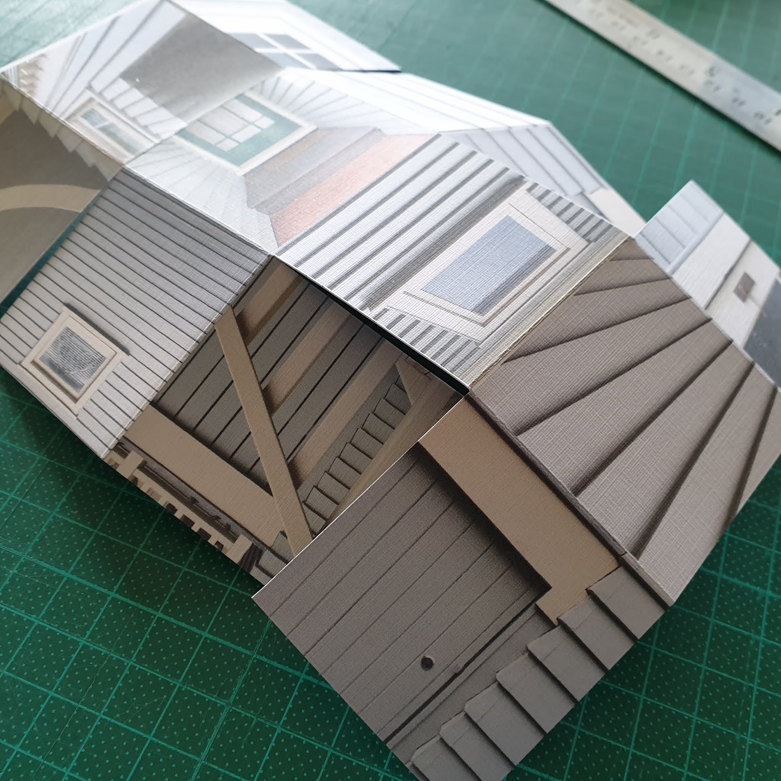
House Boxes  by Toni Hartill


"Found" was to be a group exhibition featuring explorative and experimental 
works by Celia Walker, Elle Anderson and myself, Toni Hartill. 

Plans for the exhibition, to be held in June 2020 at Studio One Toi Tu, went awry as a result of the Covid-19 pandemic. The country was placed in full "lockdown" on March 27th and all council facilities were closed. Although lockdown restrictions were gradually lifted as a result of the country's "team of 5 million" doing such a great job at eliminating the virus from our shores, the gallery wasn't able to be opened in time for our show to take place. Instead, Studio One Toi Tu has kindly offered to share some of our work on their social media platforms. So, welcome to my blog, if this has brought you here for the first time.


House Boxes  by Toni Hartill


In this post I will take you through my thought processes and share some of my experimental explorations that went in to creating what turned out to be quite an extensive and unexpected body of work. 


Printmaking is my most usual medium but I am also very interested in 
artist's books as a means of expression. 

This project tapped into my interest in folded and manipulated structures and provided lots of inspiration and discoveries that I would like to take further in my work. Visit my Gallery tab (toolbar above) to see examples of my printmaking or my Artists Book tab to see ways I am exploring this genre.


To view just the images in a post click on any image.
You will then be able to scroll through them like a slideshow.


The concept for the exhibition "Found", was dreamt up by Celia Walker long before covid was even heard of and came about as a result of the work Celia, Elle and I had created for our group show "Scattered", held at Studio One Toi Tu in May last year. 

Spookily the concept for this exhibition was perfectly aligned for work that could be created under "lockdown" conditions so there was no need to rewrite the statement:

Statement:

"Found is an examination of nearby places by artists Elle Anderson, Celia Walker and Toni Hartill.
Their works will explore the 'unofficial countryside' of the familiar/unfamiliar that is often unnoticed or overlooked, the antithesis of the drama of faraway places.

With an emphasis on using found materials, the show encourages resilience and resourcefulness, working with what is to hand in both materials and outlook."


Is this what a Residency is like?

Being required to "Stay home, save lives" and restricted to only essential trips to the supermarket or pharmacy, or for exercise close to home, suddenly my "unofficial countryside" became constrained within the boundaries of my home and garden. I found myself looking closer and literally searching for the interesting vistas and aspects of a place I am only too familiar with, having lived in this property since 1993.

Before I knew it I had begun creating quite a sizeable collection of works.  It dawned on me that this way of working "with what is to hand in both materials and outlook" felt very much as if I was doing a residency… albeit in my own residence. This in itself has been an interesting experience having never actually done a residency but  highly aspiring to the possibility of doing one, one day.


Being Resourceful.

Another aspect of the "lockdown" was that all businesses had to close. And yes, that meant art supplies shops too. I had stocked up on food and medicine items but had not thought to replenish my ink and paper supplies. I therefore had the "terrifying" realisation that, while printing some editions of new etchings, I was very near to running out of ink!! I had intended that my work would be a combination of my printmaking with collaged and assembled pieces, requiring a good supply of ink.  Hmmm... I had to think carefully about what I was going to create for this exhibition. It made sense to use what I had to hand which was my phone (camera), access to my computer, colour printer and a supply of suitable card.


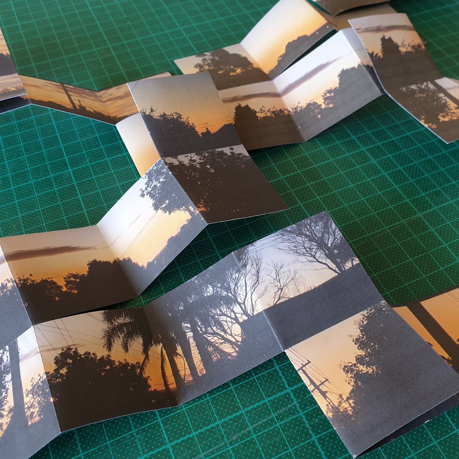
Evening Walks in Lockdown


Early inspiration came as a result of daily evening walks around the neighbourhood. We were experiencing beautiful late summer weather and the night skies were stunning. I simply began experimenting with folded structures using combinations of my photographs. 


Meander & Explosion Book Play


These meander book structures fold away into small boxes. I was thinking about how I would go out for a daily walk around the neighbourhood, then retreat back to home, to the safety of my "box".


Explosion Book Structure

This structure explodes out of the box and can just as quickly disappear back into it.
A lot like how I was feeling at the time!


House and Garden 

Naturally my attention turned to other things within my outlook - my house and my garden. I am pretty familiar (understatement) with every square centimetre of my home having lived here so long and having renovated, designed and helped build the extension and alterations and, as resident painter, painted every. single. surface. More than once. This exercise was almost as if seeing with new eyes... almost. I did reaffirm how fond I am of this home turf despite my love/hate relationship.

I began photographing aspects of home, looking for interesting details, patterns and features which I would then incorporate into more experimental structures, namely boxes. I was thinking about the experience of being boxed in and enclosed.

I focused on  exterior details of my house for the outside of some boxes...


and combined these with quirky details for inside the box....


and with various combinations of details from the garden including
plants, paving, fences and hedges.


I was constantly thinking about inside vs outside,
looking inwards, looking outwards.
Feeling confined vs protected, restricted vs focused.


House Interior


From there I began photographing a myriad of details of the interior of my home and experimented with a variety of suitable structures including concertina folds. This was all a lot of fun, and a great distraction to what was going on in the "real world" and was a reminder of how much I enjoy dioramas and miniatures, and playing with paper.


I also dabbled with ways that the interior structures could be combined with the house boxes.
Oh this could have gone on in so many directions!


Gates


I spent quite some time prowling around my property looking for interesting details and different perspectives. Next in my sights was the gate into my front garden.  I was thinking about how I was missing close contact with friends and family and what it would be like to welcome them into my home again.


Fence Structures


While exploring the garden for interesting aspects I was contemplating how the neighbours were coping. Our street had just set up a facebook page so we could all connect and for the first time, we were getting to know of each other a little. I began photographing the various fences, peeking through gaps and over and through hedges. Hmmm I wonder if my neighbours saw me skulking in the bushes? Might have looked a bit... weird.


Panorama Structures


As a result of peaking at and through fences, these next structures were created using the "Panorama" book structure from "The Art of the Fold" By Hedi Kyle, Ulla Warchol.


Initially coming to grips with how the structure works
led me on to cutting slots to peak through...


...to peer at what might be on the other side.
I was peeking at my own house, not into the neighbour's btw.


This more complicated structure, also using the Panorama structure,
 tempts the viewer to peak and peer, this time from all angles.

I was contemplating human curiosity, at times like this, when we wonder what other people are doing, how they are "getting through", how they might be occupying their time... Or is that just me? I don't think my neighbours were lurking their hedges though.


Finally, Figures!


For a bit of fun I ventured into the idea of playing with figures that could also be folded away and that reflected the surroundings of the garden or perhaps merged in and disappeared. I had restarted my yoga practice with earnest during lockdown and perhaps this new found focus worked its way into my constructions.It also reminded me of my childhood love for paper dolls. Again, this idea could have been progressed on so many ways.


The uncertainty of lockdown.

As there was no certainty, about many things, during lockdown it was hard to stay focused. I think it was a fairly common feeling for people to struggle while working towards exhibitions during this time as there was the distinct possibility that the exhibition could be cancelled at any time. And for many it was the case, as it was for us. 

For this reason I kept my approach light and experimental, needing to escape into play rather than get bogged down with anything too serious. 


Opening my mind to new ways of working.


None of the pieces are resolved to completion but instead opened my mind to many new ideas and possibilities. It was a very unusual situation that I would focus so much of my outlook on and in my own home but, strangely, this was the situation I found myself in and I am grateful to have had the unexpected opportunity. Also being limited by materials meant I was forced to keep things simple and to use what I had to hand. 


 Are you inspired?


Perhaps there are some ideas here that others might find interesting to explore in their own work. If so, please do share your thoughts and comments or send me photos of your creations. I'd love to see your take on the concepts.

I'm also wondering if this might be a good theme for running a workshop...
What do you think? 

And please reference my blog if you use 
any of my ideas in a direct way. 


Reflecting


I think many of us have reflected on many things that were highlighted at this time in lockdown - one being that we don't actually need all that new stuff. We are just as satisfied making do with what we have and in fact enjoy the challenge of looking for different ways of doing things. Having limits can help focus the mind, or so I find.


I hope that we can venture forth with a much lighter, 
and more considered, footprint on the planet.


Thanks to our NZ "Team of 5 million" for all working towards
the common goal of eliminating covid-19 from our shores.
We are now in Alert Level 1, as of 09.06.20, with NO active cases - Woohoo!
Proud, and grateful to be a Kiwi!


Thanks for visiting!